Proud as we are of our haircare ranges, Chämpo has, from its inception, stood for far more than just remarkable formulas…
For us, it’s equally as important that the provenance, quality and sophistication of the formulas inside our bottles are evidential in every detail outside them – that the shape, colour, texture and type are a sensorial delectation in themselves; creating as much of a memorable and lasting impression.
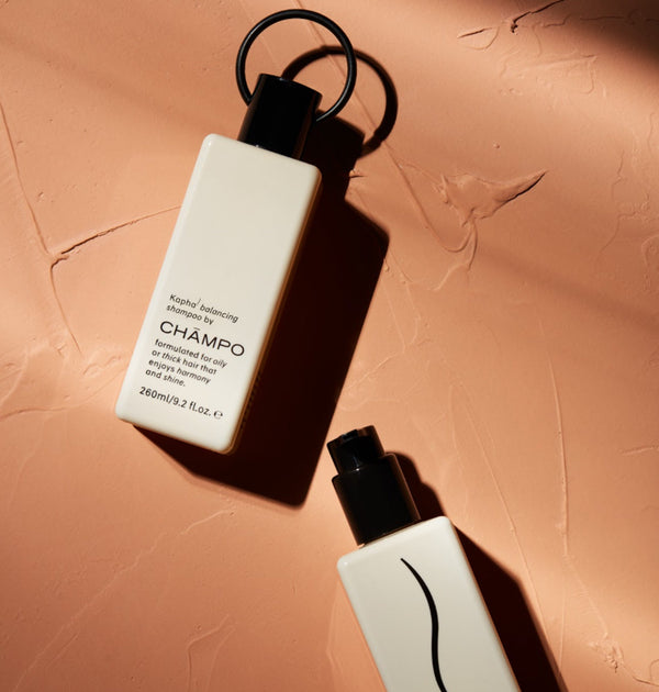
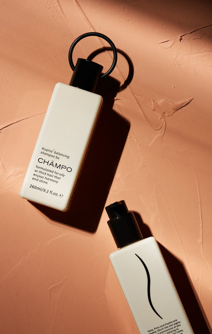
The Chämpo bottle is an entirely bespoke creation, a seamless reflection of our contemporary outlook, authentic influences and unwavering attention to detail. The inspiration for its design came from the Lota, an ancient Indian water vessel. We worked tirelessly to refine and modernise its form for our use, conscious always of the importance to avoid a naive visual pastiche of this compelling culture. Ease of use was also vital; the sides were neatened, though the subtle rounded edges were retained – along with the playful (though also useful) ring detail on the shampoo bottle.
The print on our bottles reflects an interplay of modern typography and subtle stylistic cues from the calligraphic nature of written Sanskrit. Our three haircare ranges, named after the three Dosha types, are depicted by an illustration portraying hair character – a spirited curl for Vata, a fine, straight strand for Pitta and a composed wave for Kapha. Uniquely created for Chämpo, these inscriptions also ensure our brand, bottle and Dosha range are instantly recognisable.

While each Dosha mark features prominently on our bottles, we otherwise consciously chose not to overburden the bottle with type – a very disruptive notion in an industry otherwise conspicuous for its use of rhetoric. Instead, the Chämpo story succinctly unfolds over the four sides.
Colour was another important consideration. With the profusion of haircare brands out there, you may have thought we would have opted for the rich and audacious tones traditionally affiliated with Indian culture to stand out. Quite the opposite. Colour is an especially subjective area. By choosing such distinctive tones, we risked swaying your choice of Vata, Pitta or Kapha formula (possibly away from the one that will benefit your hair the most). We therefore purposefully opted for a neutral, warm and understated colour palette; soft, subtle and stylish hues that show every detail of print on the bottles; helping you to find precisely what you need without being inundated with unnecessary or contrived pattern, tonality and messaging.
In addition to visual appeal, stimulating the sense of touch also came into play. A soft, smooth and tactile material was chosen, the print on it gently raised, while detailed on the top of the shampoo lid – where the finger falls to press it open – lie three embossed Dosha marks.

We set out to design something timeless, individual and compelling; abundant in both style and substance to convey our unique story – a reflection of both the modern and ancient influences on our brand through distinctive detail and colour. We hope you’ll agree that each and every one of these efforts has been worth it.
© 2019, all rights reserved.


